These long form articles are part of a series in which I go through the book ‘R for Data Science’ and document my learnings and understanding of concepts in R in my own way.
The basics of data visualisation
We start with the fun part, exploring and visualizing data. This is considered by many to be the biggest pay-off when it comes to learning R and provided me with loads of motivation to keep learning more and more, and to be able to produce better looking graphs as a result.
To start of, we’re going to need to load only the tidyverse.
library(tidyverse)
## -- Attaching packages --------------------------------------- tidyverse 1.3.2 --
## v ggplot2 3.3.6     v purrr   0.3.4
## v tibble  3.1.8     v dplyr   1.0.9
## v tidyr   1.2.0     v stringr 1.4.0
## v readr   2.1.2     v forcats 0.5.1
## -- Conflicts ------------------------------------------ tidyverse_conflicts() --
## x dplyr::filter() masks stats::filter()
## x dplyr::lag()    masks stats::lag()
Note that the tidyverse loads eight packages and lists their current
version number. If you don’t see the message above you have to install
the package first (install.packages("tidyverse").
You also see conflicts: some functions are provided in two packages. You
could specify which exact function from a package you would like to use
by using package::function() like so ggplot2::ggplot().
Now let’s load up a data set about fuel usage for different types of
cars (mpg) which comes with the tidyverse.
mpg
## # A tibble: 234 x 11
##    manufacturer model      displ  year   cyl trans drv     cty   hwy fl    class
##    <chr>        <chr>      <dbl> <int> <int> <chr> <chr> <int> <int> <chr> <chr>
##  1 audi         a4           1.8  1999     4 auto~ f        18    29 p     comp~
##  2 audi         a4           1.8  1999     4 manu~ f        21    29 p     comp~
##  3 audi         a4           2    2008     4 manu~ f        20    31 p     comp~
##  4 audi         a4           2    2008     4 auto~ f        21    30 p     comp~
##  5 audi         a4           2.8  1999     6 auto~ f        16    26 p     comp~
##  6 audi         a4           2.8  1999     6 manu~ f        18    26 p     comp~
##  7 audi         a4           3.1  2008     6 auto~ f        18    27 p     comp~
##  8 audi         a4 quattro   1.8  1999     4 manu~ 4        18    26 p     comp~
##  9 audi         a4 quattro   1.8  1999     4 auto~ 4        16    25 p     comp~
## 10 audi         a4 quattro   2    2008     4 manu~ 4        20    28 p     comp~
## # ... with 224 more rows
## # i Use `print(n = ...)` to see more rows
The mpg data set has 11 columns containing variables and 234 rows
containing observations. Now we create our first plot.
Mapping variables to the X and Y axis
Engine displacement (displ) versus highway miles per gallon (hwy).
We can map aesthetics to variables via the ggplot package. You can do
this explicitly like so:
# explicitly telling ggplot what to use
ggplot(data = mpg) +
  geom_point(mapping = aes(x = displ, y = hwy))

The class variable of the mpg data set classifies cars into groups
such as compact, midsize, and SUV. If the outlying points are hybrids,
they should be classified as compact cars or, perhaps, subcompact cars
(keep in mind that this data was collected before hybrid trucks and SUVs
became popular).
You can also map the colors aesthetic to the class variable. Here we
will use the tidyverse way and make use of the pipe operator (%>%).
The pipe tells whatever is on the right side, to take everything on the
left side, and use it as input for the first argument on the right
side. Your code becomes shorter and more intuitive to read.
# using the pipe operator the tidyverse way
mpg %>%  # take mpg and use it for the first argument on the right side
  ggplot(., aes(displ, hwy, color = class)) +
  geom_point()
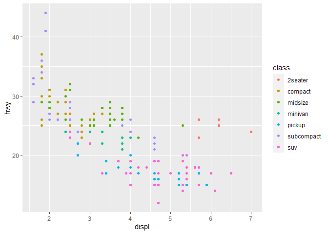
The dot character in
ggplot(., aes(displ, hwy, color = class))represents the location of the first argument and is wherempggets piped into. You can omit this as it is always the first argument after a%>%.
Mapping variables to aesthetics
Besides the X and Y axis (which are also aesthetics) there are several other aesthetics you can map variables to.
- color
- shape
- alpha; transparency
Shape
We can also map the class to the shape aesthetic:
mpg %>%
  ggplot(aes(displ, hwy, shape = class)) +
  geom_point()
## Warning: The shape palette can deal with a maximum of 6 discrete values because
## more than 6 becomes difficult to discriminate; you have 7. Consider
## specifying shapes manually if you must have them.

## Warning: Removed 62 rows containing missing values (geom_point).
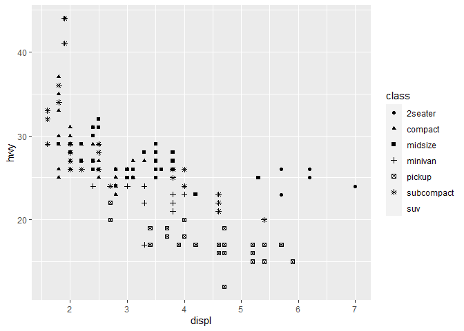
Note the warning: shapes are more difficult to compare than colors. Unless explicitly specified, 6 shapes are included in the base plot. In this case we have 7 unique values for the
classvariable and the SUV class has no shape assigned.
Alpha
For instance, if we map the class variable to the alpha aesthetic -
controlling the transparency of the points - the results are not as
clear.
mpg %>%
  ggplot(aes(displ, hwy, alpha = class)) +
  geom_point()
## Warning: Using alpha for a discrete variable is not advised.
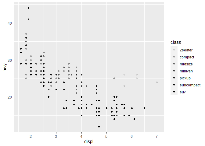
The class variable is discrete and the alpha aesthetic is not best
suited to highlight this.
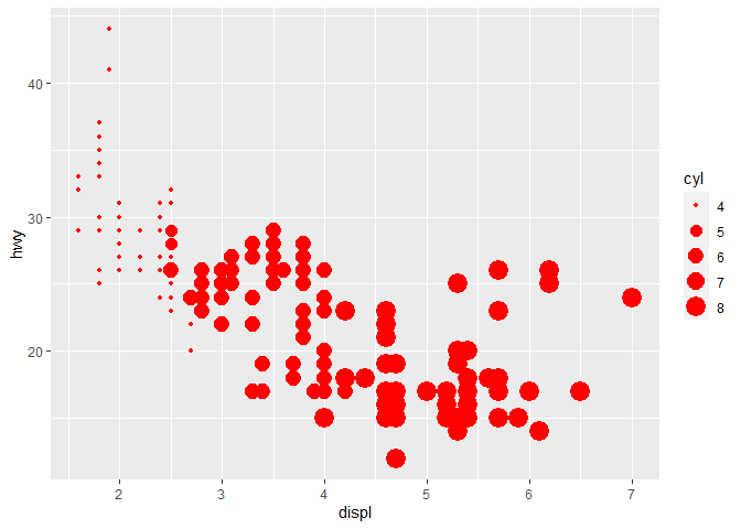
Color and shape are better suited to display categorical variables while size and alpha are better used for continuous variables.
You can also manually set specific aesthetics for a geom. You do this
inside of the geom_point() function.
mpg %>%
  ggplot(aes(displ, hwy, size = cyl)) +
  geom_point(color = "red")
Facets
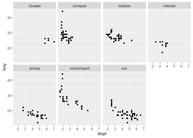
When dealing with categorical variables, facets are quite useful and
display their own subset of data. You can use facet_wrap() to facet
your plot with a single variable. The first argument that goes into
facet_wrap() is a discrete variable and is prefixed with the ~
character.
mpg %>%
  ggplot(aes(displ, hwy)) +  # plot displacement versus highway miles per gallon
  geom_point() +  # add point geometry
  facet_wrap(~ class, nrow = 2)  # facet by class and use only 2 rows for the data
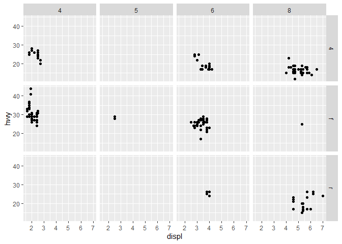
If you want to plot against two discrete variables, you can use
facet_grid(). You use two variable names, separated by a ~.
mpg %>%
  ggplot(aes(displ, hwy)) +  # plot displacement versus highway miles per gallon
  geom_point() +  # add point geometry
  facet_grid(drv ~ cyl)  # facet by drive and cylinders on x and y axes
Geometric objects
Up until now we have only used the geom_point() geom to plot and show
data. There are other options that you can use. Instead of
geom_point() you might use geom_smooth(), which creates a smoothed
line chart.
mpg %>%
  ggplot(aes(displ, hwy)) +
  geom_smooth()
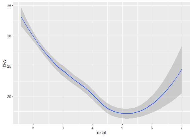
Both visualizations represent the same variables on the x and y axis and
are based on the same dataset. With ggplot(), you can use different
geoms to visualize your data. Every geom object takes a mapping
argument but not every aesthetic will work with every geom. You may
decide the shape of a point by using geom_point(shape = 5) but you
can’t set the shape of a line like that.
However, instead of using the shape aesthetic, you can use the linetype aesthetic to draw a different line for the unique variable that you map to linetype.
mpg %>%
  ggplot(aes(displ, hwy)) +
  geom_smooth(aes(linetype = drv))
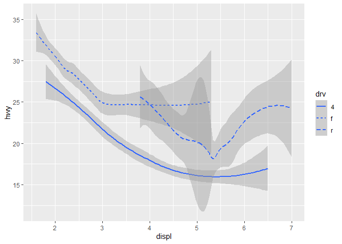
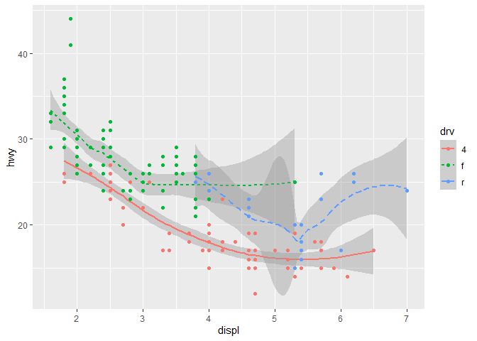
In this plot we see the lines associated with their drv values, which
stands for a car’s drivetrain (the group of components that deliver
mechanical power from the prime mover to the driven components). We see
a line for 4-wheel drive, front-wheel drive and rear-wheel drive.
But where are the original points? To make it more clear, you can simply
add the points by adding another geom. Everything you define in the
first aes() function inside ggplot() is applied on all geoms. In
the case below we color both the line and the points by their drv
value and we define specific linetypes for the geom_smooth()
component.
mpg %>%
  ggplot(aes(displ, hwy, color = drv)) +
  geom_smooth(aes(linetype = drv)) +
  geom_point()
## `geom_smooth()` using method = 'loess' and formula 'y ~ x'
You can add multiple geoms to a plot to make absolutely insane graphs.
There are over 40 geoms in ggplot2 and if you use additional extensions
to the tidyverse you get
even more. Take a look at the ggplot2
cheatsheet
and if you want to learn more about a specific geom, use ?geom_smooth.
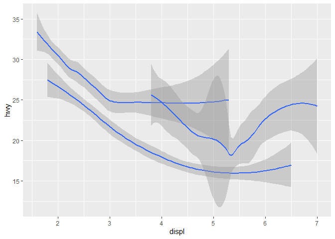
Unlike geom_point(), which maps an observation (a single row of data)
to a single point, geoms such as geom_smooth() map a whole set of
observations (multiple rows of data) to a single object (a line chart).
# mapping a variable to a group doesn't add any aesthetic properties like color or size to the plot
mpg %>%
  ggplot() +
  geom_smooth(aes(displ, hwy, group = drv))
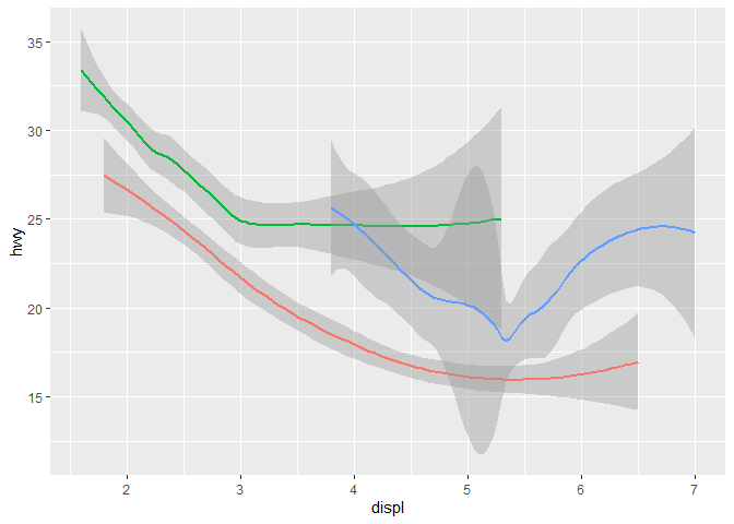
# mapping a variable to an aesthetic like color obviously does
mpg %>%
  ggplot() +
  geom_smooth(aes(displ, hwy, color = drv),
              show.legend = FALSE
  )
Multiple geoms
Simply add more geoms to the plot when you want to add more geometric
elements. You may choose to map your variables inside the different
geoms or in ggplot2. You may see some duplicate code if you decide to
map inside the geom functions.
# duplicate mapping
mpg %>%
  ggplot() +
  geom_point(aes(displ, hwy)) +
  geom_smooth(aes(displ, hwy))
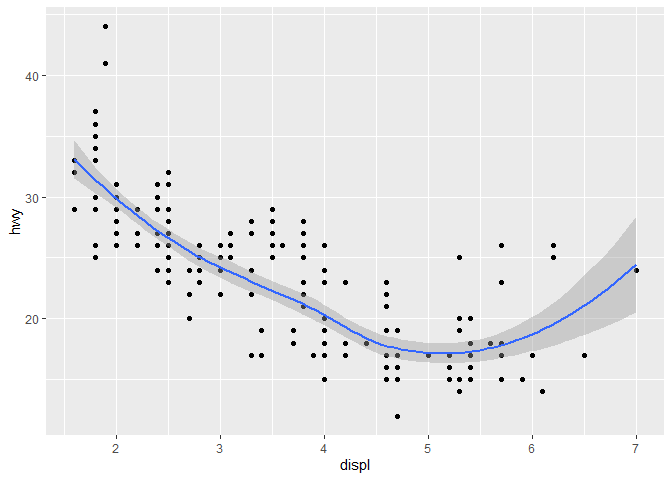
These mappings are overruled if you explicitly specify another mapping
inside the geom functions. Mapping variables to aesthetics inside the
ggplot() function are seen as global mappings and apply to all
geoms.
mpg %>%
  ggplot(aes(displ, hwy)) +  # global mappings
  geom_point() +  # empty mapping
  geom_smooth()   # empty mapping
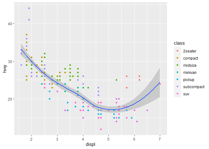
You can add a specific mapping to a single geom only. In this case we
map color to the class variable.
# adding color mapping to geom_point only
mpg %>%
  ggplot(aes(displ, hwy)) +
  geom_point(aes(color = class)) +
  geom_smooth()
## `geom_smooth()` using method = 'loess' and formula 'y ~ x'
You can also show a subset of the data for different layers (geoms). In
this next plot, the smooth line represents a subset of the class
variable. We only show the geom_smooth() for the suv class. You can
remove the shaded area representing the standard error (se) by adding
se = FALSE to the geom.
mpg %>% ggplot(aes(displ,hwy)) +
  geom_point(aes(color = class)) +
  geom_smooth(data = filter(mpg, class == "suv"), se = FALSE, show.legend = FALSE)
## `geom_smooth()` using method = 'loess' and formula 'y ~ x'
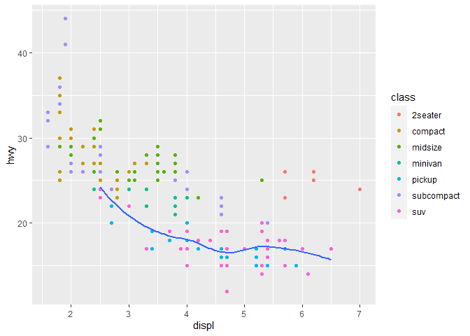
Note that inside the
geom_smooth()function, an explicit call todata = filter(mpg, class == "suv")is required as you are adding layers and no longer piping the data with%>%.
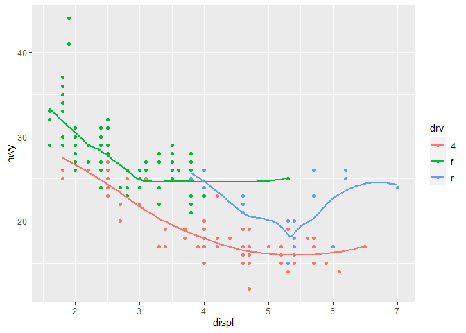
ggplot(data = mpg, mapping = aes(x = displ, y = hwy, color = drv)) +
  geom_point() +
  geom_smooth(se = FALSE)
## `geom_smooth()` using method = 'loess' and formula 'y ~ x'
Statistical transformations
So far, we have looked at functions that plot the data as-is and do
not perform any mutations or statistical transformations on the data
itself, such as creating new variables. In this section we’re going to
look at bar charts with geom_bar().
We are using the diamonds data set which comes with ggplot2. It
contains 10 variables for 53940 observations of diamonds.
diamonds
## # A tibble: 53,940 x 10
##    carat cut       color clarity depth table price     x     y     z
##    <dbl> <ord>     <ord> <ord>   <dbl> <dbl> <int> <dbl> <dbl> <dbl>
##  1  0.23 Ideal     E     SI2      61.5    55   326  3.95  3.98  2.43
##  2  0.21 Premium   E     SI1      59.8    61   326  3.89  3.84  2.31
##  3  0.23 Good      E     VS1      56.9    65   327  4.05  4.07  2.31
##  4  0.29 Premium   I     VS2      62.4    58   334  4.2   4.23  2.63
##  5  0.31 Good      J     SI2      63.3    58   335  4.34  4.35  2.75
##  6  0.24 Very Good J     VVS2     62.8    57   336  3.94  3.96  2.48
##  7  0.24 Very Good I     VVS1     62.3    57   336  3.95  3.98  2.47
##  8  0.26 Very Good H     SI1      61.9    55   337  4.07  4.11  2.53
##  9  0.22 Fair      E     VS2      65.1    61   337  3.87  3.78  2.49
## 10  0.23 Very Good H     VS1      59.4    61   338  4     4.05  2.39
## # ... with 53,930 more rows
## # i Use `print(n = ...)` to see more rows
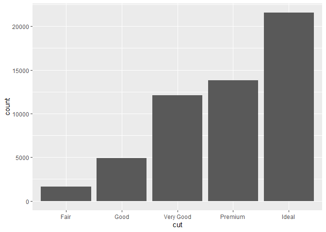
A bar chart takes a specific variable and performs a count() of all
the unique observations in that variable. In this case, cut ratings
ranging from fair to ideal.
diamonds %>%
  ggplot(aes(cut)) +
  geom_bar()
Here are some examples of how different geoms transform the data prior to creating the plot:
- bar charts, histograms, and frequency polygons bin your data and then plot bin counts, the number of points that fall in each bin.
- smoothers fit a model to your data and then plot predictions from the model.
- boxplots compute a robust summary of the distribution and then display a specially formatted box.
The transformations are performed under the hood in the so-called ‘stat’
functions. You can inspect the stat function of a specific geom by
typing ?geom_bar. You see that stat = 'count'. Every geom has their
own stat function:
?geom_point:stat = 'identity'?geom_boxplot:stat = 'boxplot'?geom_smooth:stat = 'smooth'?geom_bar:stat = 'count'
Usually you can use geoms such as geom_bar() and their respective
transformation stat_count() interchangeably. In some cases you might
want to use a specific geom but use another stat function or use a stat
function instead of a geom.
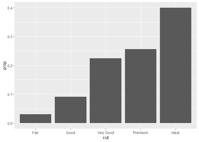
Here we use geom_bar() and a stat function to map proportions to the
y-axis. If you leave group = 1 out all proportions will be equal to 1
or 100%. The bar geom will count all rows or observations with a
specific cut, totalling 100% for each level. You override this behaviour
by adding a dummy group such as group = "whatever". Then the correct
proportions over all observations will be used.
diamonds %>%
  ggplot() +
  geom_bar(aes(cut, after_stat(prop), group = "whatever"))

Here we use stat_count() to get the same results:
diamonds %>%
  ggplot() +
  stat_count(aes(cut, after_stat(prop), group = 1))
You can use other stats for a succinct summary of the data too, such as stat_summary
diamonds %>%
  ggplot(aes(cut, depth)) +
  stat_summary(mapping = aes(cut, depth),
               fun.max = max,
               fun.min = min,
               fun = median)
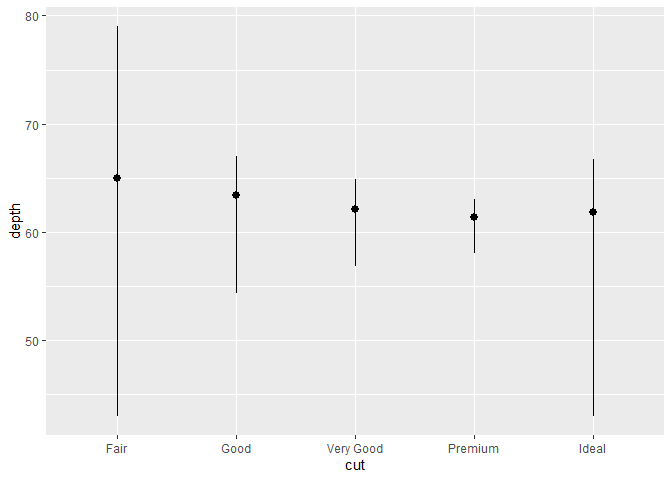
Note that this comes close to what geom_boxplot() (a statistical
summary) actually looks like. You can work around the default
functionality provided by all the geoms when you start using stats for
additional customization. I must say, geoms very often prove sufficient
for your everyday needs (so far, they have for me).
diamonds %>%
  ggplot(aes(cut, depth)) +
  geom_boxplot()
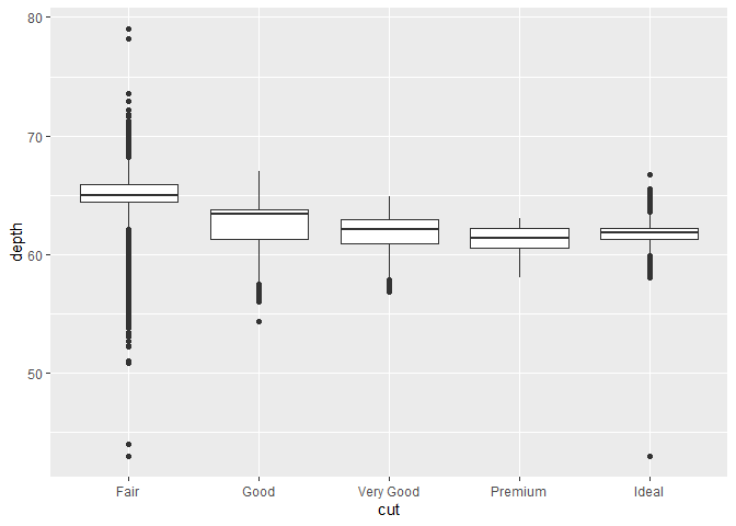
The boxplot reveals important information regarding the distribution of your data, such as:
- the median value
- the upper and lower quartile (Q1 and Q3) range
- the interquartile range (difference between Q1 and Q3)
- minimum and maximum values
- outliers
Position adjustments
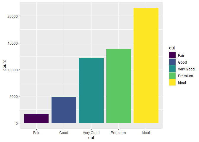
When it comes to bar charts there is another tweak you can perform in order to change how the bar chart is displayed. You can fill with a color and map the color to a variable.
diamonds %>%
  ggplot() +
  geom_bar(aes(cut, fill = cut))  # fill the bars with color based on the different cuts
 There are a few noteworthy position adjustments for bar charts:
"stack""identity""fil""dodge"
Stack
You can add another variable by mapping fill to something else then
cut, let’s say clarity. Now we add mapping (fill) for every subset
of clarity for the different cuts available. The default position for
geom_bar() is "stack".
diamonds %>%
  ggplot() +
  geom_bar(aes(cut, fill = clarity),  # add mapping (fill) for every subset of clarity in available cuts
           position = "stack")  # this is the default position for geom_bar() but it needs another variable in order to fill!
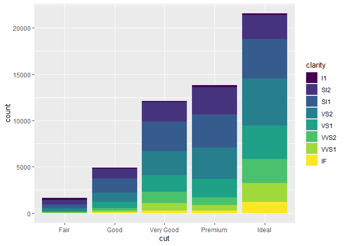
The way these bars are stacked is performed automatically by the
position adjustment which is specified by the position argument
inside geom_bar(), the default position is "stack". It stacks the
counts for all subsets of cuts and fills by clarity.
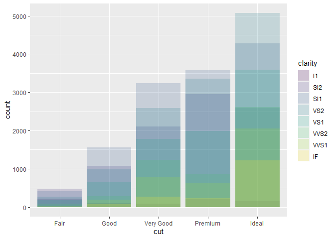
Identity
The "identity" position shows the data exactly where it would lie in
the graph itself. It is not useful for bar charts and is the default
position for 2d geoms like geom_point(). For bar charts, the
"identity" position causes the segments to overlap because it counts
all different subsets and plots the colored bars over each other.
diamonds %>%
  ggplot(aes(cut, fill = clarity)) +
  geom_bar(alpha = 1/5, position = "identity")
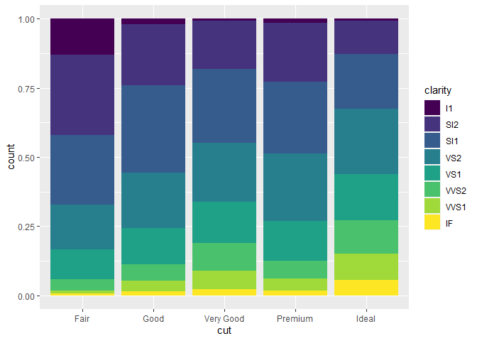
Fill
The "fill" position works just like the "stack" position but makes
all the different bars equal height. This makes it easier to compare the
proportions between groups.
diamonds %>%
  ggplot() +
  geom_bar(aes(cut, fill = clarity), position = "fill")
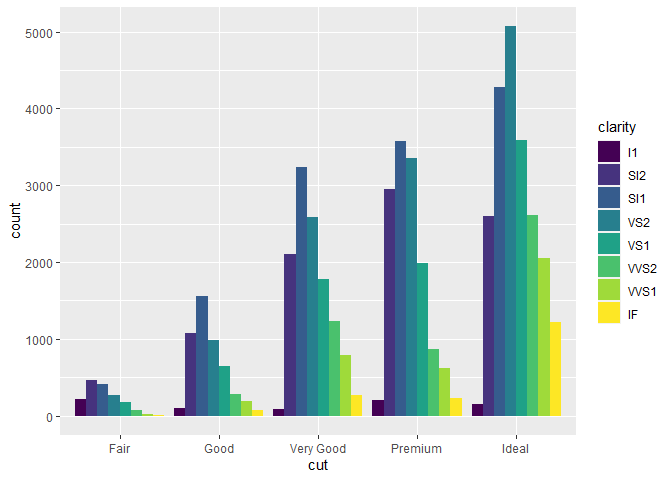
Dodge
The "dodge" position places all objects side by side which makes it
easier to compare the values per group.
diamonds %>%
  ggplot() +
  geom_bar(aes(cut, fill = clarity), position = "dodge")
Jitter
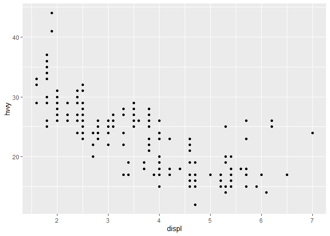
There is another type of position adjustment that is quite handy. Not for bar charts but for scatter plots. In the first plot that we made, many of the individual points were overlapping. We note 234 observations. If you would count the individual points you wouldn’t arrive at this number. This problem is called overplotting and it is caused by rounding so the points appear on the grid used by ggplot.
nrow(mpg) #count rows in mpg dataset
## [1] 234
mpg %>%
  ggplot(aes(displ, hwy)) +
  geom_point()
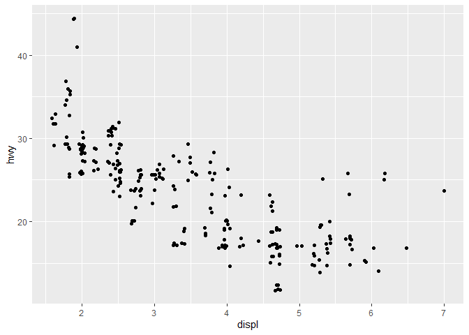
You can avoid this grid by using position = "jitter" which adds random
noise to all the points. There is even a shorthand for this position
specifically, geom_jitter(). Note the randomness applied to all points
in both graphs. Take care with this position adjustment at small scales
as it makes your graph less accurate. It can be quite revealing on
larger scales and with lots of data to work with.
mpg %>%
  ggplot(aes(displ, hwy)) +
  geom_point(position = "jitter")  # or use geom_jitter() instead
Coordinate systems
Another aspect of building graphs is the coordinate system. The standard coordinate system used is the Cartesian system. In the Cartesian system, the X and Y axis act independently to determine the location of the data (go along the X axis, then up along the Y axis).
There are a few other coordinate systems that might be useful on the rare occasion:
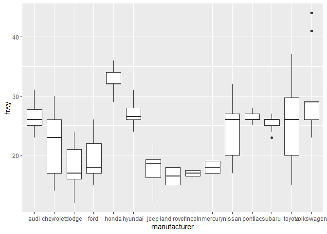
coord_flip(): swaps the X and Y coordinates, very usefull for data with a lot of groups and labels (specifically longer labels)!
mpg %>%
  ggplot(aes(manufacturer, hwy)) +
  geom_boxplot()
mpg %>%
  ggplot(aes(manufacturer, hwy)) +
  geom_boxplot() +
  coord_flip()
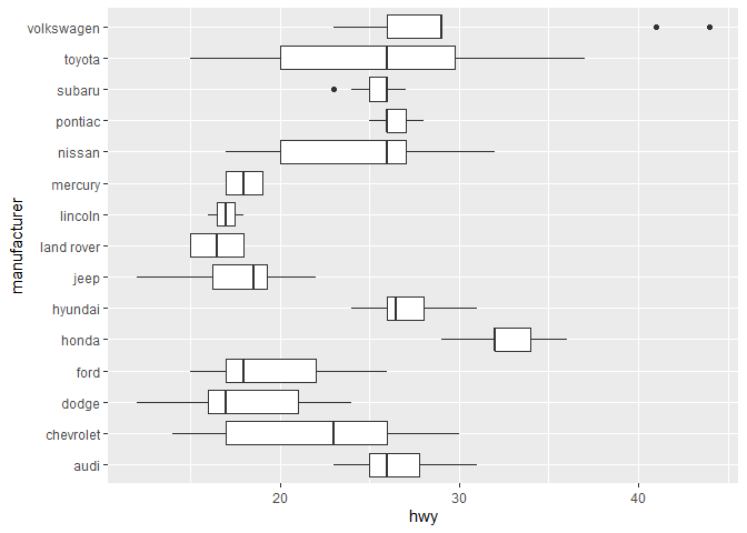
Note that you can also achieve the same result by flipping the X and Y aesthetic! I didn’t realize this until quite recently.
mpg %>%
  ggplot(aes(y = class, x = hwy)) +  # instead of aes(x = hwy, y = class)
  geom_boxplot()
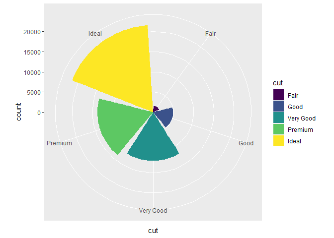
coord_polar(): uses polar coordinates in which each point on a plane is determined by a distance from a reference point and an angle from a reference direction. The polar coordinate system is probably most often used to make pie charts.
chart <- diamonds %>%
  ggplot(aes(cut, fill = cut)) +
  geom_bar()

chart + coord_flip()
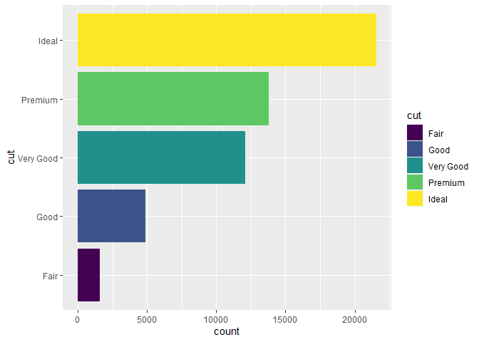
chart + coord_polar()
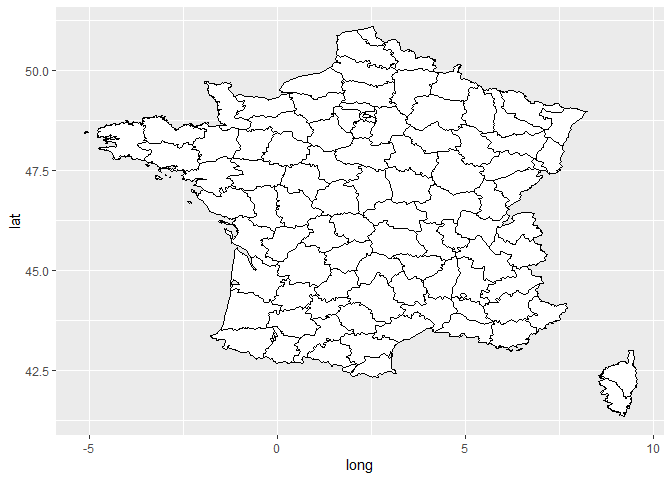
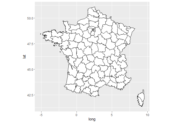
coord_quickmap()is used when plotting spatial data such as maps to set the correct aspect ratios. You can clearly see the difference in the plots of France below.
#library("maps")
map <- map_data("france")

ggplot(map, aes(long, lat, group = group)) +
  geom_polygon(fill = "white", color = "black")
ggplot(map, aes(long, lat, group = group)) +
  geom_polygon(fill = "white", color = "black") +
  coord_quickmap()
The layered grammar of graphics
We’ve demonstrated that you build graphics using different layers. This way of visualizing data has been dubbed the grammar of graphics. Ultimately, the template for this is (the tidyverse way):
diamonds %>%  # specify the data you wish to use and pipe it in
  ggplot(aes()) +  # call the ggplot function and set global mapping if required
  geom_bar(  # use a specific geom for your plot
     mapping = aes(cut, fill = cut),  # set specific aesthetic mapping for the geom
     stat = "count",  # specify the stat used by the geom
     position = "stack"  # specify the position adjustments for the geom
  ) +
  coord_flip() +  # specify another coordinate system
  facet_wrap(~clarity, nrow = 4, ncol = 2)  # faceting by clarity in four rows and 2 columns
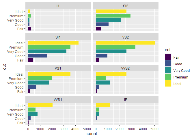
Remember, most often the default stat or position will work for you. There are cases where you want to overwrite or customize your graph and this knowledge will proof essential to manipulate your graph to your liking.